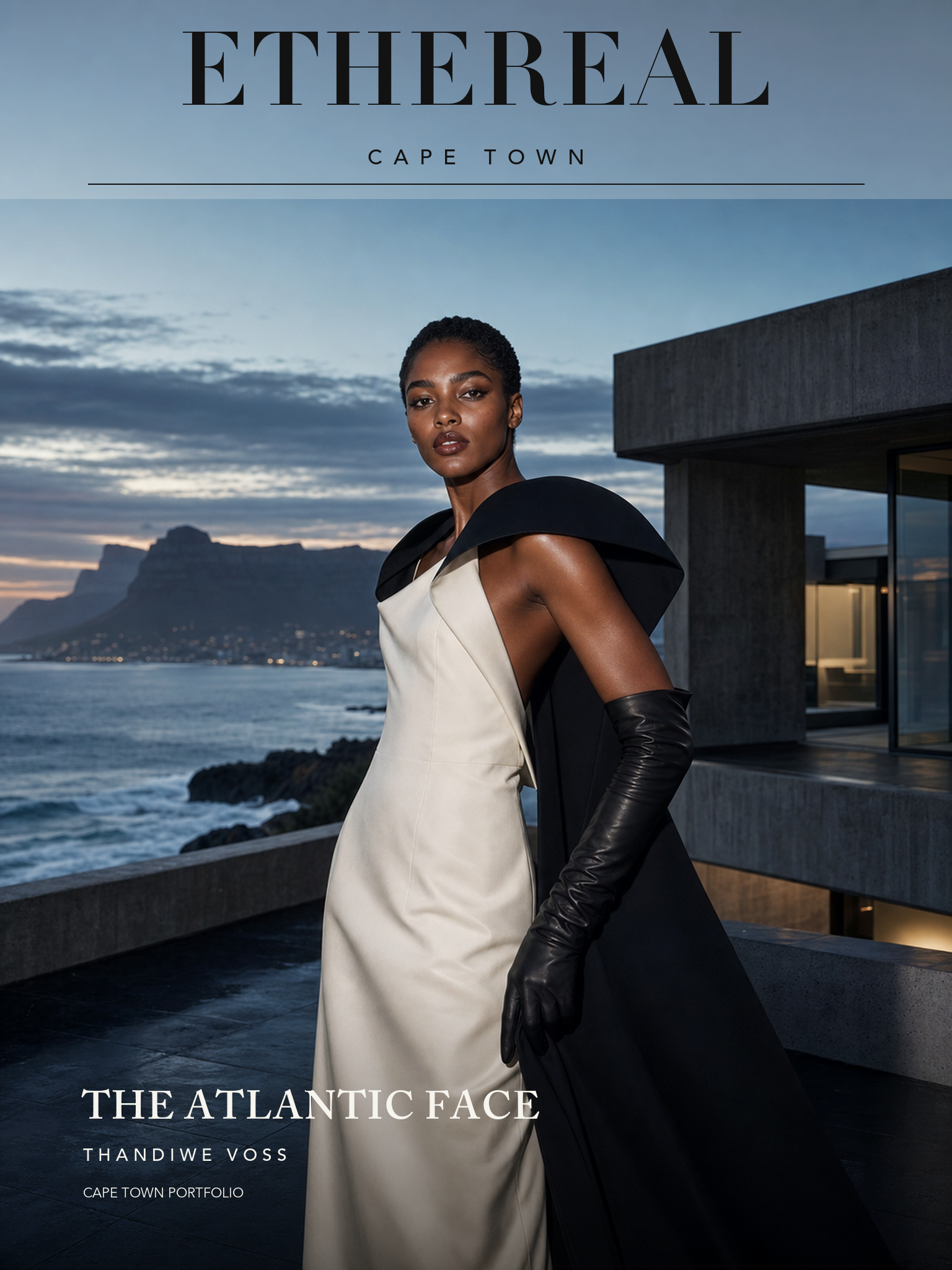
The Atlantic Face
A Cape Town launch built from clean image bases and real-font typography: no ugly baked-in mastheads, no pseudo-type, no repeated ad template.
The mountain is atmosphere. The model is the campaign.
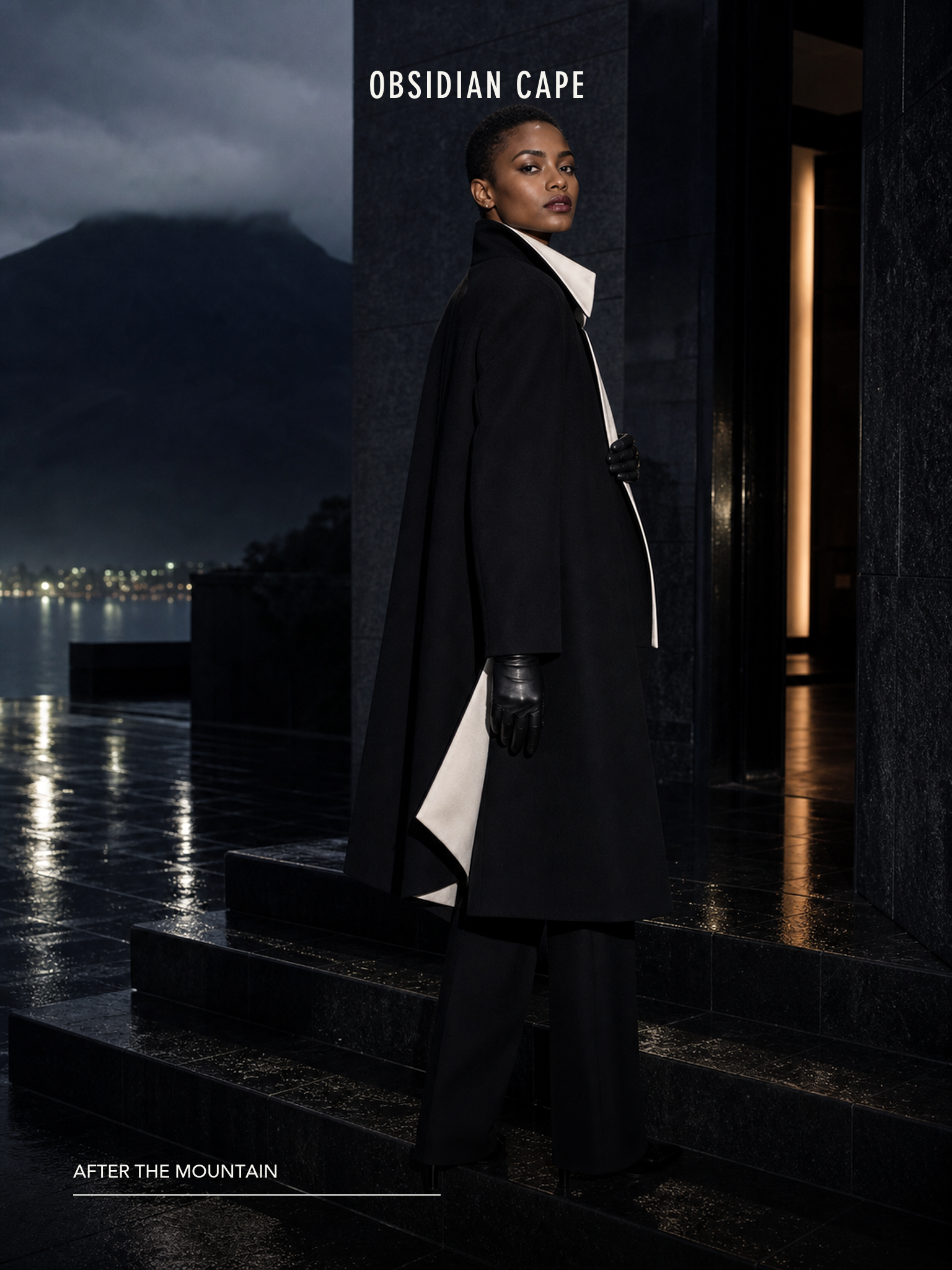
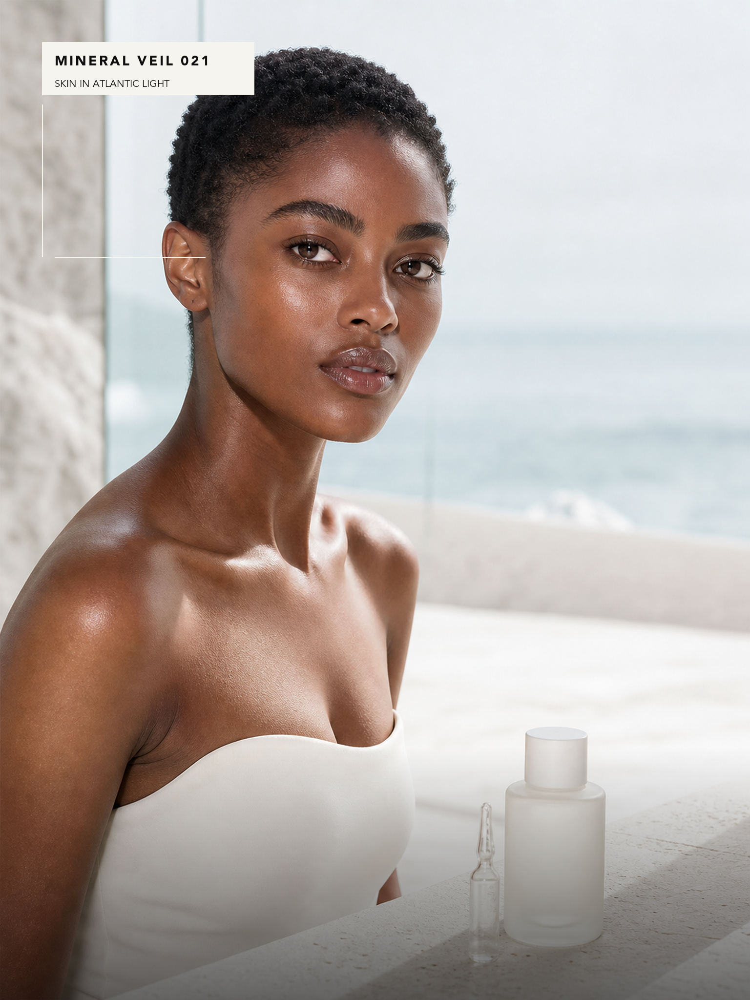
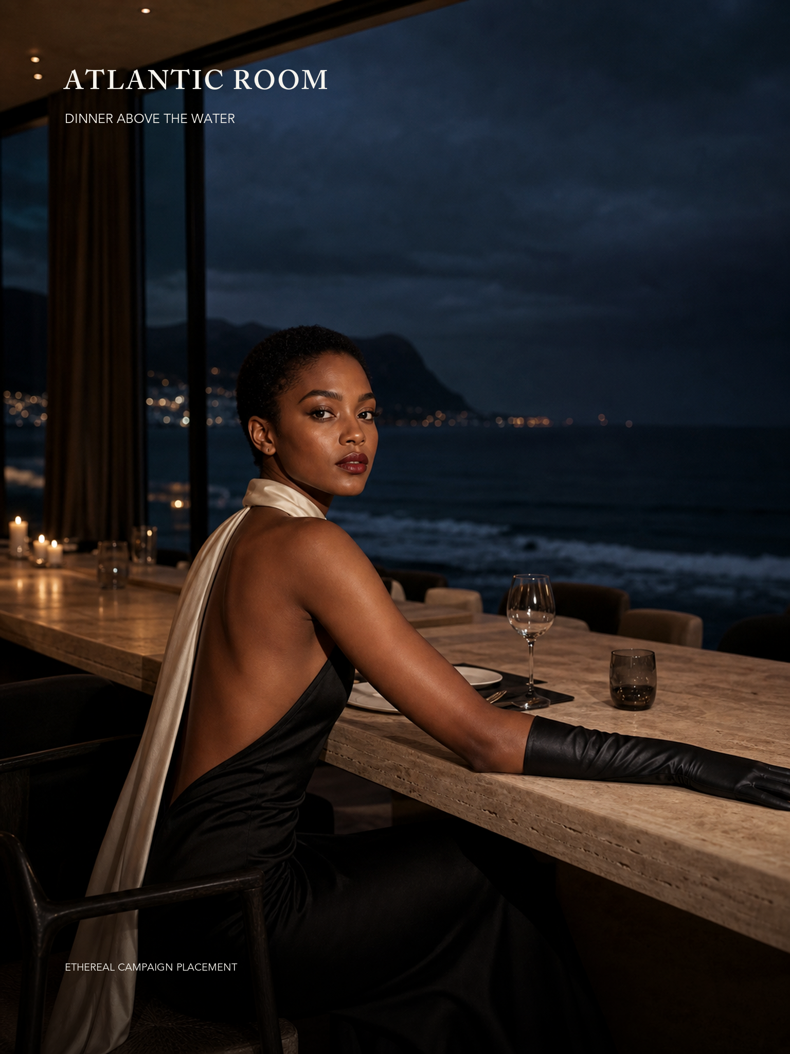
Thandiwe Voss gives Cape Town a commanding Atlantic register: black stone, coastal architecture, mineral beauty, and private dining held by a face with cover authority.
OBSIDIAN CAPE, MINERAL VEIL 021, and ATLANTIC ROOM define her launch range across outerwear, skincare, and hospitality without repeating the standard jewelry-fragrance formula.
The public cover typography was generated directly inside the image as publication-grade typography so the masthead behaves like a high-end fashion magazine, not an AI-rendered label.
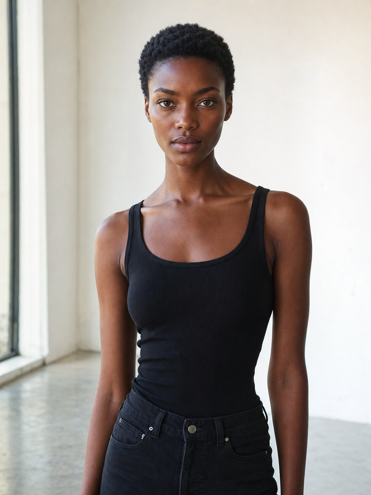
Book the face.
Build the world.
License Thandiwe Voss for a campaign system with controlled image usage, stills, motion, territory, duration, approvals, and production handled through Ethereal.
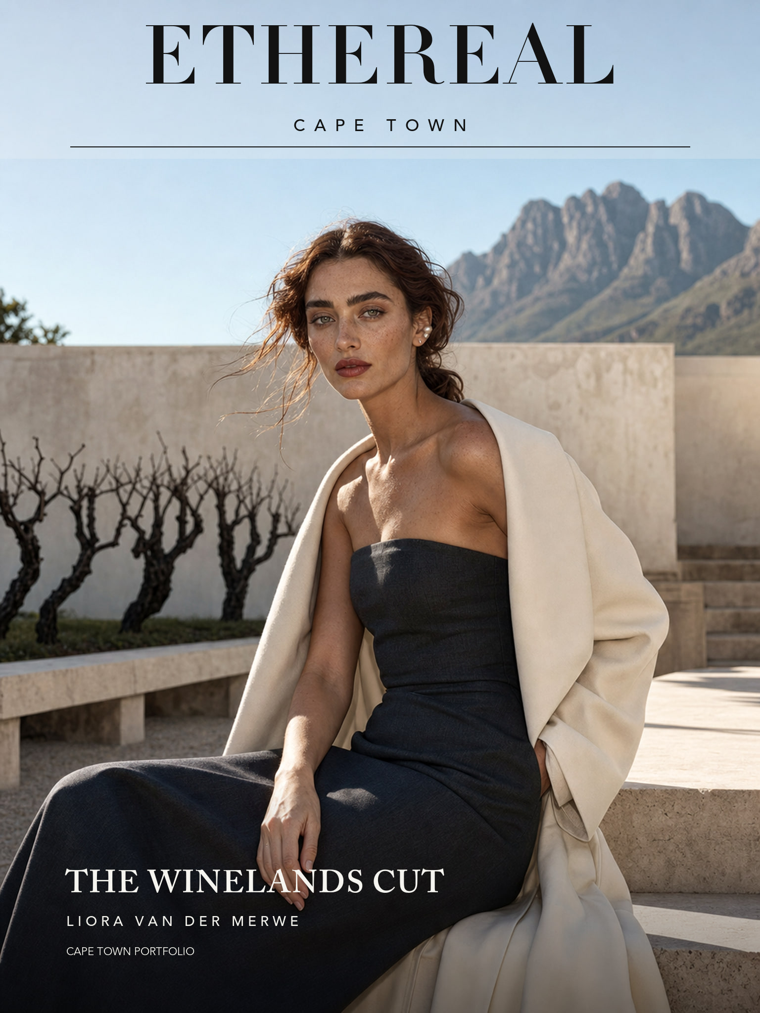
The Winelands Cut
Liora Van Der Merwe turns Cape estate hospitality, fynbos fragrance, and hard-sun eyewear into a precise campaign suite.
Curated Reading
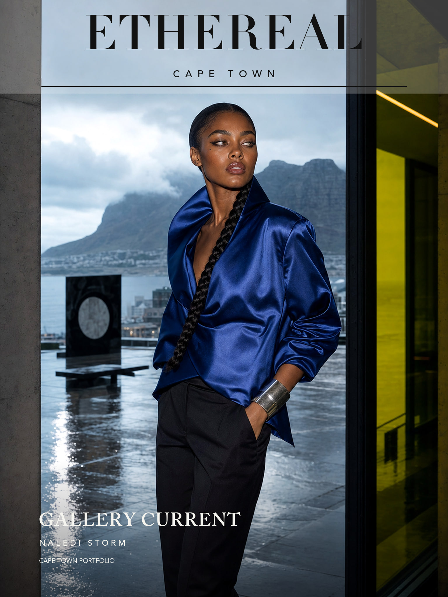
Gallery Current
Naledi Storm brings Cape Town art-district energy into sound objects, haircare, harbor jewelry, and a cobalt cover.
Read Editorial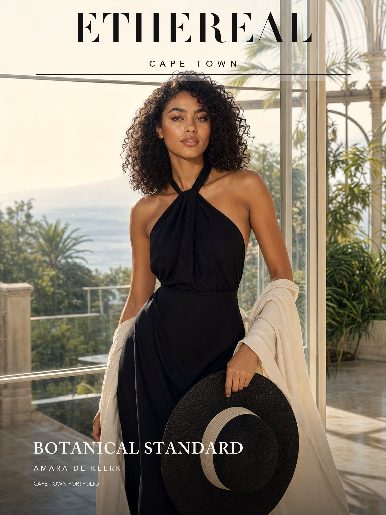
Botanical Standard
Amara De Klerk turns Cape Town glasshouse hospitality, rooibos beauty, and marina travel into a warm campaign system.
Read Editorial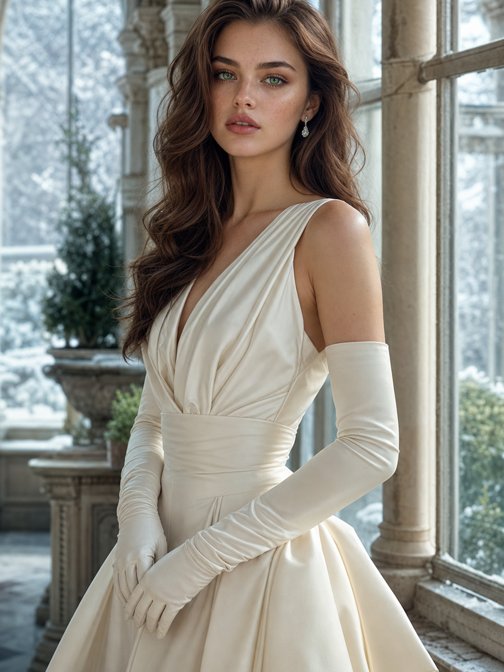
Vasilisa in the Winter Room
A cold-light couture study in emerald gaze, porcelain skin, and campaign-grade synthetic consistency.
Read Editorial